既有的圖片或照片該怎麼分色呢? | File set-up for Risograph printing? |
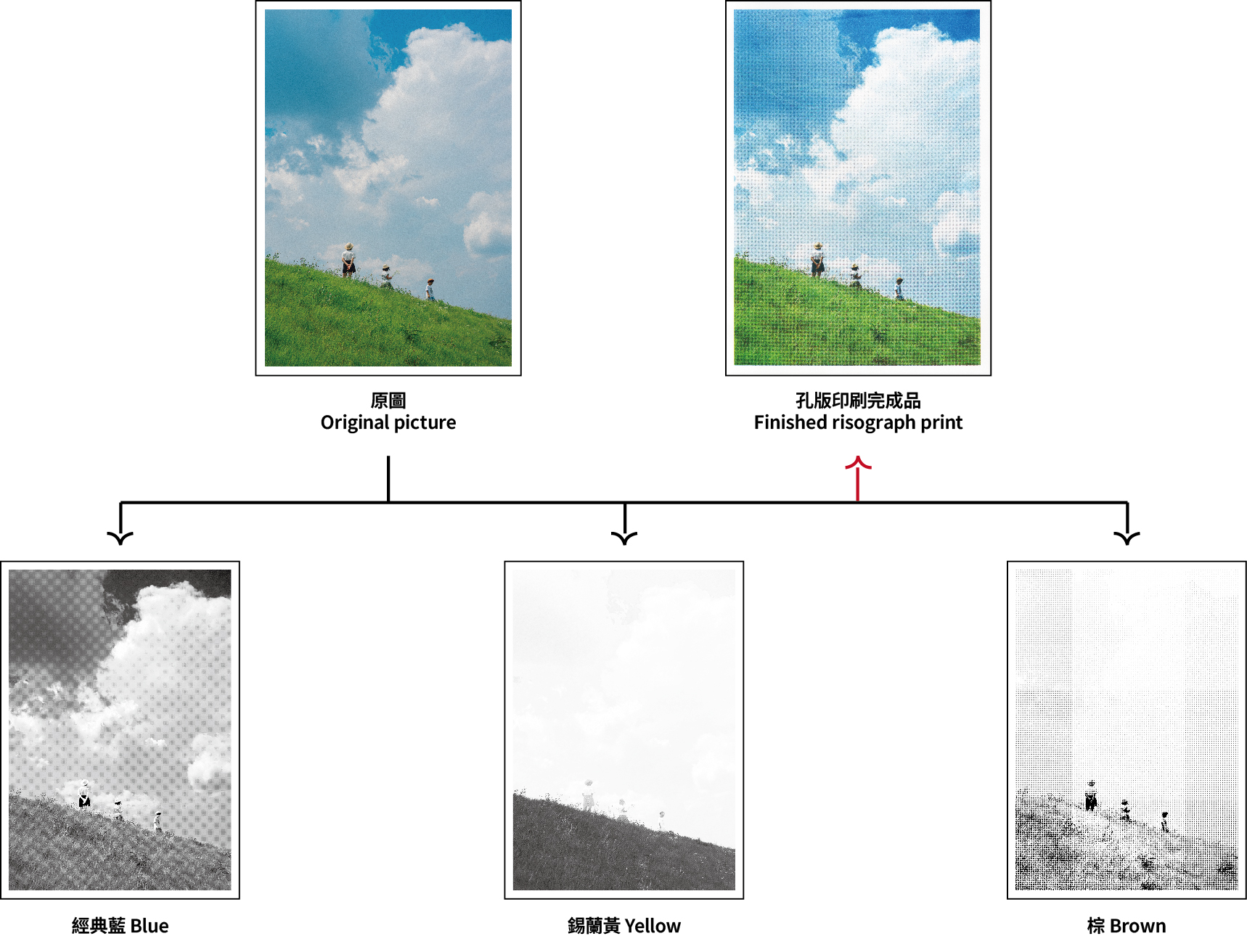
最簡單的做法,是先在 Photoshop 將圖片分離成四色色版,再依照想使用的 RISO 油墨顏色來製版印刷。 常見的四色組合為:螢光粉(Fluorescent Pink)、天空藍(Cornflower)、黃色(Yellow)和黑色(Black)。 如果想玩得更有趣,也可以在轉出四色色版後再調整各色版的對比與濃度,或是只保留其中兩個色版製作雙色印刷。 也有不少創作者會嘗試以相近色取代原本的配色,例如將黑色換成棕色、天空藍換成經典藍,創造出不同的印刷氛圍。 下面我們給大家一個簡單的示範。 | The simplest way to prepare an existing image or photograph for Risograph printing is to separate it into four color channels in Photoshop, then assign each channel to a RISO ink color. A common four-color combination is Fluorescent Pink, Cornflower, Yellow, and Black. For more creative results, you can adjust the contrast of each channel, print with only two channels to create a duotone effect, or replace standard colors with alternatives—for example, swapping Black for Brown or Cornflower for Medium Blue. Below is a simple example of the process. |
建議交疊處的K值百分比介於40~70%,四色交疊處相加小於250,
若是濃度過高交疊出的顏色容易髒掉
We recommend keeping overlapping areas at 40–70% per channel,
with the total coverage of all four colors staying below 250%.
Higher coverage may cause colors to appear muddy.
不過要特別注意的是,即便是選擇四色印刷,完成品的色彩表現都會和原始檔案有所差異。畢竟孔版印刷並不是以精準還原照片為目標,而是透過油墨疊色、網點與錯位誤差,產生獨一無二的效果。 也正因為如此,孔版印刷的過程充滿了實驗性與驚喜,這也是許多人喜歡它的原因之一。 | Keep in mind that even with a four-color setup, the final print will look different from the original image. Rather than aiming for perfect color reproduction, Risograph printing embraces the unique effects of overlapping inks, halftone patterns, and slight registration shifts. This element of experimentation and surprise is one of the reasons so many people love Risograph printing. |